Inspired by Laura Ellis (aka @LittleMissData’s) post, Data Storytelling, I decided to take Flourish for a spin to look at NBA-team win percentages over the course of the season thus far. 🏀
As advertised, Flourish is a tool for “powerful, beautiful, easy data visualisation” that lets you “quickly turn your spreadsheets into stunning online charts, maps and interactive stories.” Clearly someone on the Flourish team and I are on the same wavelength when it comes to carnival games and data visualization, since the animated rank or relative-score chart that caught my eye turned out to be named the Horserace template.
@lenkiefer there was a chart animation you did once that I said reminded me of the carnival horse-race game, but I can't remember which post it was! 🏇 https://t.co/XfsiYNuLwd pic.twitter.com/ZRGu6iwhFF
— Mara Averick (@dataandme) January 13, 2018
The hardest part (which wasn’t very hard at all) was un-tidying my data to fit their spreadsheet model, with the x-axis variable (number of games played, in my example) as column headers.

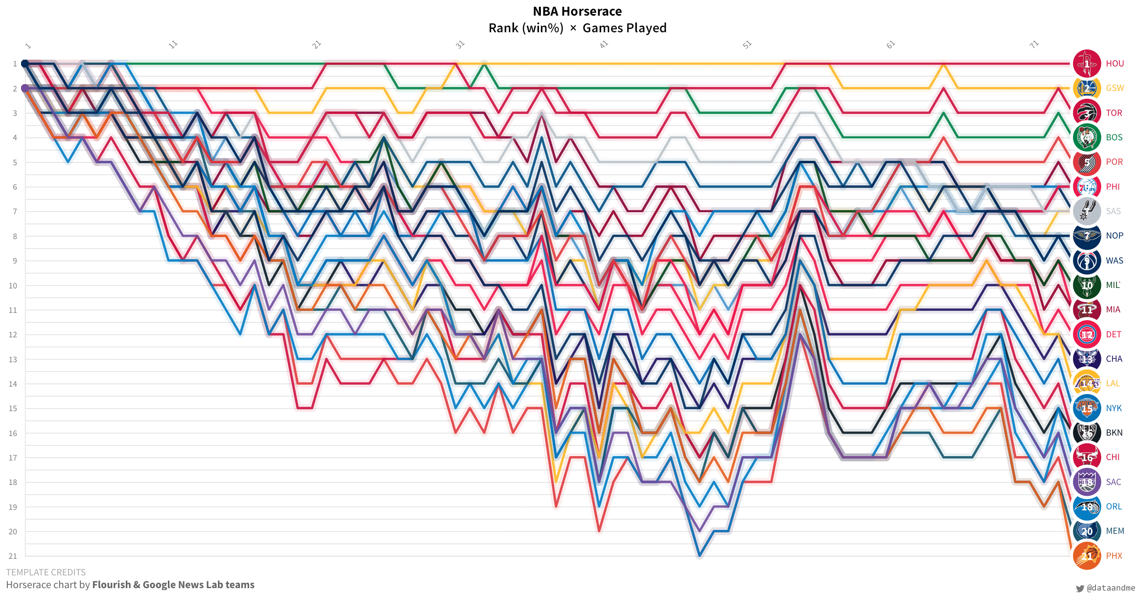
After that, there were very few design decisions to be made, which (I think) is part of the allure of such a tool. Going with the Ranks (as opposed to Scores) view as default was an easy decision, since the actual win-percentage values tend to be pretty close, making things look quite cluttered.

The limited “possibility space”1 makes for a “beginner-friendly” visualization tool. Of course, there’s a trade-off — you can’t add another layer of labels or annotation with a + sign. Actually, the title in the banner for this post is “after-market” (read: I added it to the image outside of Flourish).
Anyhow, you can see the chart in the embed below, though, if you happen to be on your computer I recommend viewing it here 🔗, since my blog template is too narrow a view-port for a chart of this nature (IMHO).
Here it is as a GIF, just in case — umm, I can’t actually think of a use case, but I like GIFs. 🎦

Bonus chart: Tankathon 📉
All in all, Flourish is a fun tool, and definitely worth playing with yourself. Big ups to the folks at @f_l_o_u_r_i_s_h, who helped me figure out how to add custom colours to my chart!
Nice @f_l_o_u_r_i_s_h horserace chart of @NBA data by @dataandme. pic.twitter.com/NOYWXAezUh
— Flourish (@f_l_o_u_r_i_s_h) March 27, 2018
So much better, right?!
Ah— finally figured out that I could just paste the colours in the colour-scheme box! #NBA sanity restored 🏀 pic.twitter.com/jLzLj0G2pQ
— Mara Averick (@dataandme) March 28, 2018
Shout-out to Elijah Meeks, who loves that term.↩