
I came upon a post by Andrew Heiss, Working with R, Cairo graphics, custom fonts, and ggplot, and couldn’t help but notice that the featured font was one I’d seen before…

I thought I could forget about it— move on with my life. Maybe I could just load the tidyverse, recreate Andrew’s plot, and be done with the whole thing.
library(tidyverse)

# Create sample data
set.seed(1234)  # This makes R run the same random draw
df <- data_frame(x = rnorm(100),
                 y = rnorm(100))

# Create plot
p <- ggplot(df, aes(x = x, y = y)) +
  geom_point() +
  labs(title = "This is a title",
       subtitle = "This is a subtitle") +
  annotate("text", x = 0, y = 0, label = "This is some text",
           family = "Papyrus", color = "darkred", size = 8) +
  theme_light(base_family = "Comic Sans MS")
p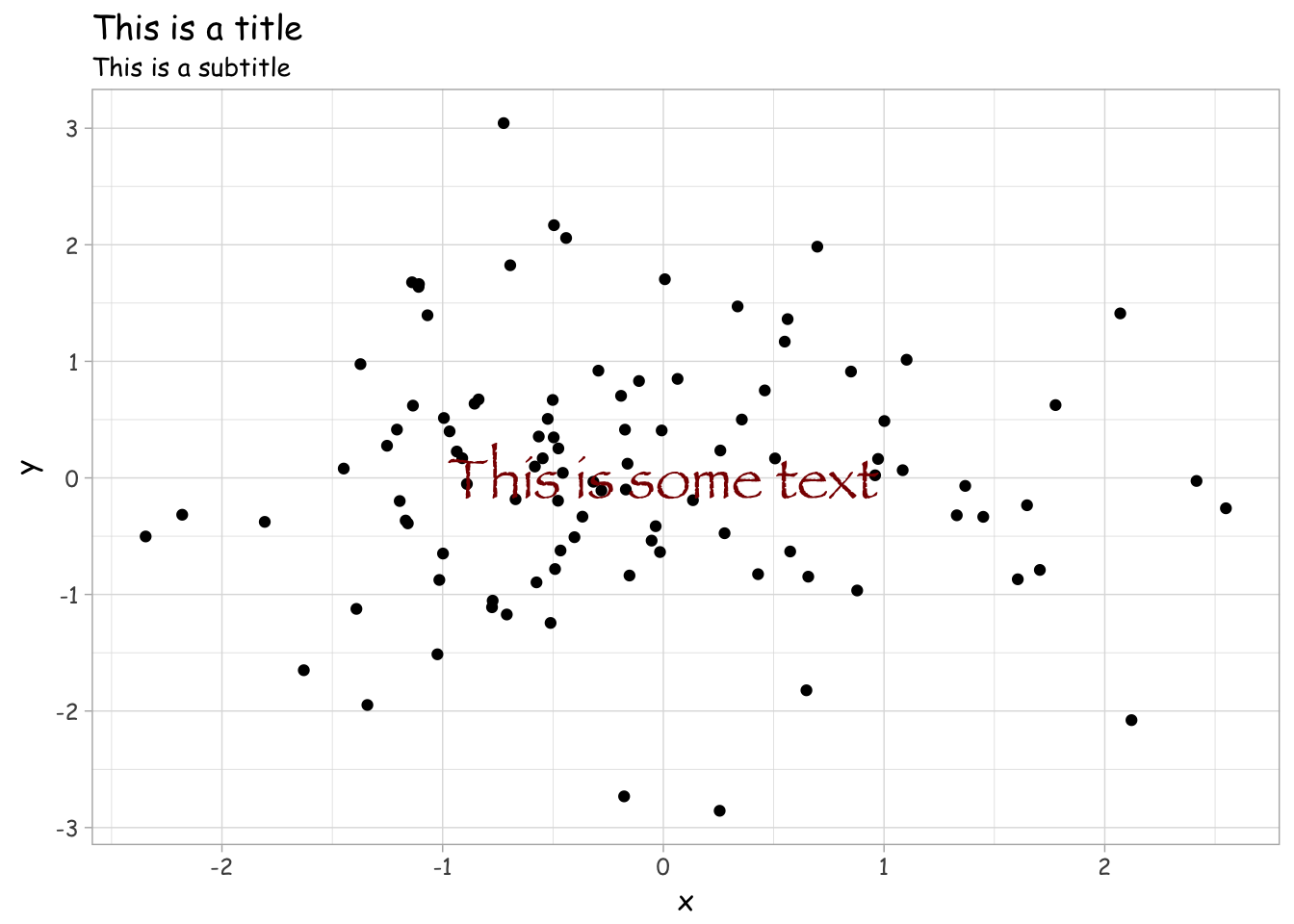
But no— that was too easy. His font choice mocked me, still.

So I did what I had to do. I pulled the appropriate data from Box Office Mojo, and made it all nice and R-friendly using Miles McBain’s datapasta package/add-in.
# abbreviated version shown for aesthetic reasons
data <- tibble::tribble(
            ~Date, ~Rank,  ~Weekly.Gross, ~X..Change, ~Theaters, ~Change,      ~Avg.,  ~Gross.to.Date, ~Week,
       "Aug 6–12",   73L,      "$10,511",  "-48.40%",         1,     -1L,  "$10,511",  "$749,766,139",   34L,
   "Jul 30–Aug 5",   58L,      "$20,353",  "-18.90%",         2,     -1L,  "$10,177",  "$749,755,628",   33L,
      "Jul 23–29",   55L,      "$25,099",     "0.03",         3,     -1L,   "$8,366",  "$749,735,275",   32L,
      "Jul 16–22",   54L,      "$24,371",  "-62.70%",         4,     -5L,   "$6,093",  "$749,710,176",   31L,
       "Jul 9–15",   47L,      "$65,367",     "0.25",         9,      0L,   "$7,263",  "$749,685,805",   30L
)

data %>%
  ggplot(aes(x = Week, y = Theaters)) +
  geom_point() +
  annotate("text", x = 17, y = 1500, label = "AVATAR",
           family = "Papyrus", color = "skyblue2", size = 24) +
theme_minimal(base_family = "sans")![]()